Task 1
Youtube
The website I choose to write about is you tube ( www.youtube.co.uk) which is the biggest video websites ever, you can see it as google as well but you tube is only videos. The purpose of the website is to watch videos that people upload or TV programmes , music videos and even films. You tube is a quick to use, you do not even need to sign for it, it will just play the video you want to see. To sign in to you tube you need a google mail account to have your you tube account. Playing the video does not take long, it depends on you internet speed but some times when you try to play a video it takes long to load the video to play it. When you upload your own video , depending on the size of the video it will take about 20 minutes or longer. The design is really simple but has about of adverts around it. On the top left it has its logo which is :

On the website the logo is small but the web is poplar which this means that they do not make it big because everyone knows the website and the logo of by heart so its pointless to have it big. Next to the logo is a search panel were you write what you are searching for. There is a search button right next to it which you click on to search. Next to the search button is listings on browser, TV shows and upload. When you put the mouse on to it , each of the listing get a underline which shows where you are pressing. At the top right end are signs which says : create account and sign in. by clicking on them you could create your account or sign in. on the homepage there are sections of spotlight: UK music, catch up on the latest TV, videos being watched now, featured videos. At the end is the most popular which is listed as :
Entertainment Music
News and politics Film and animation
Sport Howto and style
Comedy Travel and events
Most viewed Top favourite
After you clicked on the one you want to see it shows you a series of videos which are put into the category. At the bottom of the page are listing of help, about safety, privacy, terms, copyright, up loaders and partners, developers, advertising. So the bottom is all about helping the user using the website and knowing why things go wrong. The front which is used is Arial and some writings are bold to light what the category the videos are in. the colour is white and simple but when the videos are on the homepage it looks really colourful. The founders of you tube are Chad Hurley, Steve Chen and Jawed Karim, was found 14 February 2005. All of the founders were employee’s of paypal and the first video that was uploaded was ‘ me at the zoo’ which was loaded in April 23, 2005. The target audience for you tube is for all ages because in you tube you can watch what ever you want, there is not age limits except the 18 + ones. In some opens you tube is education because of the research you do, you learn new things.
Ebay
The other website I choose to write is ebay( www.ebay.co.uk ) which is one of the most poplar websites. The purpose of the website is to sell items and buy items from all around the world. The functionality is fast but you would need to sign in to it so you can buy things off it or sell. To sign it does not take long, its only about you user name and password and details of your address, really simple. After signing in you can start biding on items are you could just buy things. The design of the website is quite simple and complex, when you first open the website you have the logo of the company, which is:

The logo is on the top left which you can early see. Right next to the logo there is the user name which shows who’s account it is on. Under the user name is a column were you can write what you are searching for which makes life more easier. Right next to it is a categories search where you pick the categories you are looking for. There are about 33 category on the categories search, you pick one of them and it researchers for you. Under the search there is a listings which you can click on. In the section there is categories, fashion, motor and daily deals. The colours that have been used is not colourful, its just white but has adverts all around it which does not make the page dull. The shapes that have been used are only squares, inside the squares are listings of the items which are put on sale. The text is written in Arial but some writings are in bolded to show what it is listings. Right on the top of the website is a column of details which is presented as :
| Buy Browse categories Shopping tools Buy with confidence Ebay mobile Partner centre | My ebay Summary Selling Buying Account Messages Saved searches | Sell Sell an item How to sell Seller fees Sell safely Sell for charity Business centre power seller hub | Community New Discussion boards Answer centre Group My world | Contact us | Help Help topices Contact us Resolution centre Safety centre |
There are adverts only on the sides on the screen so it does not stop the audience not seeing the listings or any other things. Ebay was first found in September 3 1995. The founder is Pierre Omidyar which put a laser printer which was broken on sale. It was sold about $14. Pierre then emailed the winning bid about the printer not working and the reply of the winner was ‘ I'm a collector of broken laser pointers’. ebay was not called ebay in 1995, the name of the website was echo bay technology but when they tried registering the name it was found that it was already in use so they had to change it. Afterwards coming up with a short name , ebay.com was realist. The company of ebay is Americaninternet. The target audience for ebay is 18 + because when you make an account it wants the person to be over 18. Even if the children look on ebay to find games or so on I think the website is for 18 over. Ebay is mostly used for interest and buying things you can not buy any more on stock.
Playstation 2
As for my device I have chosen Playstation 2 slim, Playstation is a game console. The purpose of the device is playing games to entertain the player. The functionality is straight forward, you plug the AC adapter into the back of the Playstation 2 and then plug it into the wall socket. Then plug the video cords to the TV and Playstation and its works but the only thing that’s needed is to have a Playstation 2 play to play and a controller. You might want to have a memory card as well to save the game you have played so you can go back to it and play from the place you lifted. When the power comes on, the first thing you see on the console is a red light. You would need to press the red light to made the Playstation come on which you see it turns into a green light. After that you on the left side of the console you would see a blue button which you would need to press to open the lid to put the game CD in and close the lid by hand and then press the green light button again to get started. The loading of the game takes less then 30 seconds to open the starting page of the game. The logo design is:


You would see this logo on the top of the Playstation console but in black and you would see this logo on the Playstation 2 games beginning. The Playstation comes in all different colours but the mean one is black and silver. The shape is a long rectangle but slim as the same time. The controller is in black and its designed to hold the controller confineable in your hand. The person that come up with play stations were Ken Kutaragi which he is known as ‘’the father of play station’s’. The manufacture is song computer entertainment ( Japan/ Tokyo) which playstation two is the sixth generation. The release of Playstion 2 slim was in 2004, 4 years after playstation 2 come out. I think the target audience is 3 over because most of the games have 3 + which means 3 years and over and under 35 years old. I think the most audience are male and ins interest, being entertained.
Nintendo dsi
For my second device I have chosen nintendo DSI. The purpose of the device is being entertained by playing games on the go ,taking photos, going on to the internet, downloading games, dsi shopping, recoding voices/ sound and playing with the sound by adding sound effects, picto chat Nintendo and you can listen to music. The functionality is you plug the AC adapter to the Nintendo Dsi and wait about 4 hours so the batteries are fully filled. After that you would need to insert the ds game and get ready to go. After the batteries are filled, when you open the dsi you see a power button on the bottom left which you need to press to get started. Then the power light will light into blue and the starting point will come up. The first thing the dsi beings to the screen is a warning about health and safety but if you touch the screen it will being you to the system settings were you would need to set up the date, time, birthday, username, colour and you can write message. Next to the system setting should a an image of the game which you click on it and get started. The logo for Nintendo is :

Nintendo is a rectangle shape/ slim. It has two cameras which one is inside the DS and one in the outer part. The dsi as four buttons inside it , in the right part and in the left side is the up, down, left and right button. On the bottom right is the start and select buttons. On the left side is the volume button and in the right side is the dsi pen and memory card slot. On the left top are three lighters were one is for the power light which is blue but when the battery is low the blue light changes into red, one for the charger which is orange when you charger it and the other is the wireless which is yellow. The Nintendo dsi is touch screen but only the bottom screen. The colour of the Nintendo dsi are in many different colours, black, white, pink, blue and red etc. Nintendo dsi is the seventh generation era and the manufacturer is Nintendo. I think the target audience are 7 to 50 because of the type of games there are to play this. Its educational as well as entertaining.
Task 2 :
What Vector Images is based on having perfect lines, points, curves and shapes which uses mathematical equations to have a perfect shape. When you have an image and you enlarge it, you will see everything in good quality, you even read the litter works. The programmes which uses vector is flash which is the most common programme to create images for games and animation. The common vector formats are adobe Illustrator, windows metafile, auto CAD, Computer graphics metafile, Corel exchange and CorelDraw. The key points about vector images are scalable, it has not background and its cartoon-like. The first vector graphic display was the US Sage air defence system.
The differences between vector and bitmap is shown in the picture :
Bitmap images are made from pixels which are small litter boxes which create the image. There are about 32 dots of colour going in each direction. When you enlarge an image which is created by pixels, can clearly see each individual square dot of colour, even the background is pixels even thought they appear to be one solid colour. The common bitmap formats are BMP, GIF, JPEG, PNG, PSD and PCX. The popular programmes which uses bitmap are Microsoft Paint, Adobe Photoshop, Corel Photo-Paint and Coral Paint Shop Pro. All the scanned images are bitmap and all of the images from digital cameras are bitmaps. What bitmap images have pixels in a grid, resolution dependent, resizing reduces quality , easily converted and restricted to rectangle.
Raster images are created through the process of scanning art work or painting with a photo editing or paint program such as Corel Photo Paint or Adobe Photoshop. Raster again is a collection of dots called pixels which is the same as bitmap. Bitmap is called raster as well. When an image is rendered in a raster-based image editor, the image is composed of millions of pixels.
Anti- aliasing just fools the eyes, it looks really smooth but its does not have smooth edges of the images. This is used in computer games or graphical cards. Its just the level being changed to a lower opacity which then makes the image look smooth but is not smooth. Alisaing is mostly used in pixels and makes the image look good.
Aliasing occurs when there are sharp contrasts between two side-by-side colour or greyscale pixels producing visible jagged lines along an angled edge, due to the square nature of pixels, the building blocks of digital images.
Colour Space is a method of representing colours in terms of measurable values such as the amount of red, yellow and blue in a colour image. A geometrical system used to describe a range of colours. Adobe RGB and sRGB are the most commonly used colour spaces in digital imaging.
 Optimisation is the process of fine-tuning the display quality and file size of an image for use on the Web or other online media. So what optimisation does is make the size of the file smaller to open it on a website.
Bit depth quantifies how many unique colours are available in an image's colour palette in terms of the number of 0's and 1's, or "bits," which are used to specify each colour. For a greyscale image, the bit depth quantifies how many unique shades are available. Images with higher bit depths can encode more shades or colours since there are more combinations of 0's and 1's available.
| Bits Per Pixel | Number of Colors Available | Common Name(s) |
| 1 | 2 | Monochrome |
| 2 | 4 | CGA |
| 4 | 16 | EGA |
| 8 | 256 | VGA |
| 16 | 65536 | XGA, High Color |
| 24 | 16777216 | SVGA, True Color |
| 32 | 16777216 + Transparency |
|
| 48 | 281 Trillion |
|
DPI (dots per inch) is probably the most familiar and most misused measure of resolution. For desktop publishing, it is probably the least important measure as well. It is not the resolution of scanned images. It is not the resolution of images on screen. It is the measure of how many dots of ink or toner a printer can place within an inch (or centimeter).
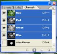
The alpha channel is an additional channel that can be added to images. It contains transparency information about the image, and depending on the type of alpha it can contain various levels of transparency. The alpha channel basically controls the transparency of all the other channels. By adding the alpha channel to an image you control the transparency of the red channel, green channel and the blue channel.
There are two types of alpha channels, pre-multiplied alpha and straight alpha.
Ÿ Pre-multiplied Alpha (used by Photoshop)
 Ÿ Straight Alpha
The biggest benefit of using alpha channels is visual appeal. Without alpha channels images layered over one another would not be anti-aliased, and therefore, would have a blocky jagged edge to them, which is not attractive. Another benefit of alpha channels is speed. When you save an image with the alpha channel all of the opacity levels are saved with it. You can then place that image over anything you like and the image will still maintain its appearance. This saves time because you can place the image directly over a background without the need to save that image in exactly the right spot over that exact background.
 What masking and layers in Photoshop and video is images or videos put on top of each others. In Photoshop you would have only one photo which you would need to edit, to make that work look better you add layers such as other pictures of elements put onto the photo to make it look like it was took with the photo. With videos its more or like having effects on the video such as transitions which you put on the video. Masking is just having shadows on the photo to make it look realistic.
 Formats:
EPS format which stands for Encapsulated PostScript are a special kind of PostScript file, restricted to describing a single page. The characteristics of EPS is its 2D, ASCII (although they can sometimes be set up to include binary data!), Colours or Black and White, no compression, Based on vectors rather than bit map and contain 1 image only (this is the main fact distinguishing an EPS file from a regular PS file!).
PNG files can does a good job on showing both line graphics and bit-mapped graphics. Most web browsers support the PNG format, which makes it easy to include pictures directly in a web page. What the PNG has is binary, it has colour( 24 bit), its 2D, it loss less compression and only has 1 image.
The TIFF file format is different in that it allows for a flexible set of information fields. The TIFF specification defines a framework for an image header called 'IFD' that is essentially a flexible set of specifically those tags that the TIFF writer software wishes to specify. The clear benefit of this scheme is that almost any information can accompany an image, while little information is absolutely needed, and image headers remain as lean as possible. TIFF defines support for multiple images in a single file.
The format uses 32bit offsets.
JPEG is the right format for those photo images which must be very small files, for example, for web sites or for email. JPG is often used on digital camera memory cards, but RAW or TIF format may be offered too, to avoid it. What JPEG has is binary, colours ( 24 bit, which 8 bits each are of RGB, its 2D, lossy compression and only has Image.
The GIF format is one of the most popular formats on the Internet. Not only is the format excellent at compressing areas of images with large areas of the same colour, but it is also the only option for putting animation online. What GIF has is Binary, colours ( but no more then 256 colours which are from a palette), its 2D, lossless compression and it can have multiple images.
The BMP which is bitmap pixels have about 24 bits of colour and its not multiple images. BMP is a standard file format for computers running the Windows operating system. The term “device independent” means that the bitmap specifies pixel colour in a form independent of the method used by a display to represent colour.
PSD is a file format used to create and edit images in Adobe Photoshop. It is a widely accepted format as it supports all available image types – Bitmap, RGB, Duotone, Grayscale, Indexed Colour, CMYK, Lab, and Multichannel. The best thing about Psd format is it can save images in layers. In other words, the image may be opened with Adobe Photoshop anytime at a later date and each individual layer, or part, may be adjusted and edited independently to achieve better effects. Special blending effects may also be achieved using the transparency mask of Photoshop. The maximum size of a PSD file is 30,000x30,000 pixels and may be saved with 16 bits per colour channel.
Ai format is a vector graphics editing program which is native to adobe illustrator and is used to store adobe illustrator drawings. AI file is limited to a much smaller number of drawing commands and it contains no programming logic at all.
The SWF file format was designed as a very efficient delivery format and not as a format for exchanging graphics between graphics editors. The format is primarily intended for on-screen display and so it supports anti-aliasing, fast rendering to a bitmap of any colour format, animation and interactive buttons. Files work well on limited hardware, while taking advantage of more expensive hardware when it is available. The files are designed to be rendered at a high quality very quickly. The following document describes the file format in detail. A character has a 16-bit numeric name. Every character in a file must have a unique name.
Lossless and lossy compression are terms that describe whether or not ,in the compression of a file, all original data can be recovered when the file is uncompressed. With lossless compression, every single bit of data that was originally in the file remains after the file is uncompressed. All of the information is completely restored. This is generally the technique of choice for text or spread sheet files, where losing words or financial data could pose a problem. on the other hand, lossy compression reduces a file by permanently eliminating certain information, especially redundant information. When the file is uncompressed, only a part of the original information is still there (although the user may not notice it). Lossy compression is generally used for video and sound, where a certain amount of information loss will not be detected by most users. The JPEG image file, commonly used for photographs and other complex still images on the Web, is an image that has lossy compression. Using JPEG compression, the creator can decide how much loss to introduce and make a trade-off between file size and image quality.
Ebay :
Ebay , (2009) ,eBAY INC. REPORTS FOURTH QUARTER AND FULL YEAR 2009 RESULTS
http://files.shareholder.com/downloads/ebay/867139445x0x345224/b455630d-4bb9-4ba5-adb1-40dcf29e82ce/eBay_Q409EarningsRelease.pdf
http://www.happynews.com/living/online/history-ebay.htm
Date of accessed : 22/09/2010
you tube:
Jefferson Graham , USA today, ( 21/11/2005 9:35pm) video websites pop up, invite postings.
http://www.usatoday.com/tech/news/techinnovations/2005-11-21-video-websites_x.htm
Date of accessed : 22/09/2010
Playstation :
Rob Fahey , ( 27 April, 2007) , Farewell, father
http://www.eurogamer.net/articles/farewell-father-article
Date of accessed : 22/09/2010
Vector and bitmap :
Sue Chastain , Vector and bitmap images two types of 2D graphics
http://graphicssoft.about.com/od/aboutgraphics/a/bitmapvector.htm
Date of accessed : 22/09/2010
Vector and bitmap photo:
http://en.wikipedia.org/wiki/File:VectorBitmapExample.svg
Date of accessed : 22/09/2010
Raster image:
Jay Busselle, Director of Business Development, Digital Art Solutions,
Raster images versus vector images,
http://www.signindustry.com/computers/articles/2004-11-30-DASvector_v_raster.php3
Date of accessed : 28/09/2010
Anti- aliasing :
Ant- aliasing , http://www.pantherproducts.co.uk/Articles/Graphics/anti_aliasing2.shtml
Date of accessed : 28/09/2010
Photo of anti - aliasing and aliasing:
http://www.google.co.uk/imgres?imgurl=http://upload.wikimedia.org/wikipedia/commons/a/ae/Anti-aliasing.jpg&imgrefurl=http://commons.wikimedia.org/wiki/File:Anti-aliasing.jpg&usg=__TDGT1-Oc4I2hnseZ14ceyorOBn8=&h=429&w=300&sz=12&hl=en&start=0&zoom=1&tbnid=k3SVhZOEfO3omM:&tbnh=109&tbnw=76&prev=/images%3Fq%3Daliasing%26um%3D1%26hl%3Den%26sa%3DN%26rlz%3D1R2ADFA_enGB371%26biw%3D1003%26bih%3D482%26tbs%3Disch:1&um=1&itbs=1&iact=rc&dur=47&ei=TWGiTKCpN4qHswbnkqSKBQ&oei=TWGiTKCpN4qHswbnkqSKBQ&esq=1&page=1&ndsp=16&ved=1t:429,r:1,s:0&tx=53&ty=34
Date of accessed : 28/09/2010
Colour space :
http://www.pcl.co.nz/Info/Glossary.html
Date of accessed : 29/09/2010
The photo for colour space :
http://www.google.co.uk/imgres?imgurl=http://www.colblindor.com/wp-content/images/CIE%25201931%2520color%2520space.png&imgrefurl=http://www.colblindor.com/2007/01/18/cie-1931-color-space/&usg=__3H9uTVzfsw6QmN1kWSki_1Ip1Sw=&h=359&w=325&sz=55&hl=en&start=0&zoom=1&tbnid=Off9DsAU2jLf3M:&tbnh=105&tbnw=97&prev=/images%3Fq%3DColour%2Bspace%26um%3D1%26hl%3Den%26safe%3Dactive%26biw%3D1020%26bih%3D592%26tbs%3Disch:1&um=1&itbs=1&iact=rc&dur=64&ei=ofaiTNeMI8qMOPOZgYQD&oei=ofaiTNeMI8qMOPOZgYQD&esq=1&page=1&ndsp=19&ved=1t:429,r:2,s:0&tx=64&ty=93
Date of accessed : 29/09
Bit depth :
http://en.wikipedia.org/wiki/Color_depth
Date of accessed : 29/09/2010
PNG Portable Network Graphics:
http://www.mywebsite.force9.co.uk/png/
Date of accessed : 29/09/2010
JPEG :
http://people.sc.fsu.edu/~jburkardt/data/jpg/jpg.html
Date of accessed : 29/09/2010
GIFS:
Matt Mickiewicz and Nicky Danino, (December 26th, 1999)
http://articles.sitepoint.com/article/gif-jpg-png-whats-difference
Date of accessed: 29/09/2010
Alpha channels info:
Using Alpha Channel to Blend Image on a Background Smoothly
http://www.icongalore.com/xp-icon-articles/alpha-channel-explained.htm
Date of accessed : 04/10/2010
Eps format:
The EPS file format, (03/02/2010)
http://www.prepressure.com/library/file-formats/eps
Date of accessed : -4/10/10
IFF:
Tag Image File Format
http://www.awaresystems.be/imaging/tiff/faq.html
Date of accessed : 4/10/10
PSD:
Adobe Photoshop File Format Summary
http://www.fileformat.info/format/psd/egff.htm
Date of accessed : 06/10/10
AI:
http://en.wikipedia.org/wiki/Adobe_Illustrator_Artwork
Date of accessed : 06/10/10